Your OpenClaw assistant, working for you 24/7
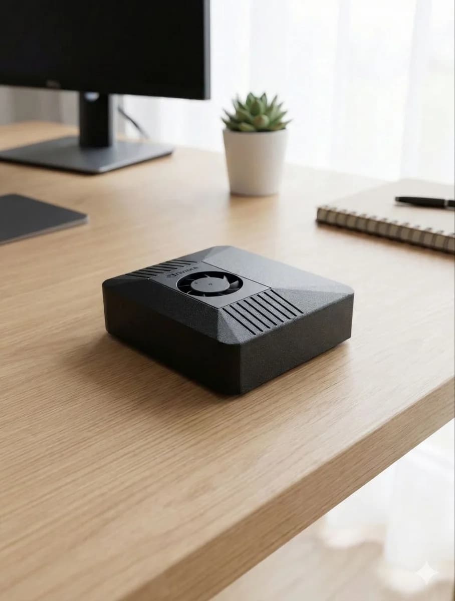
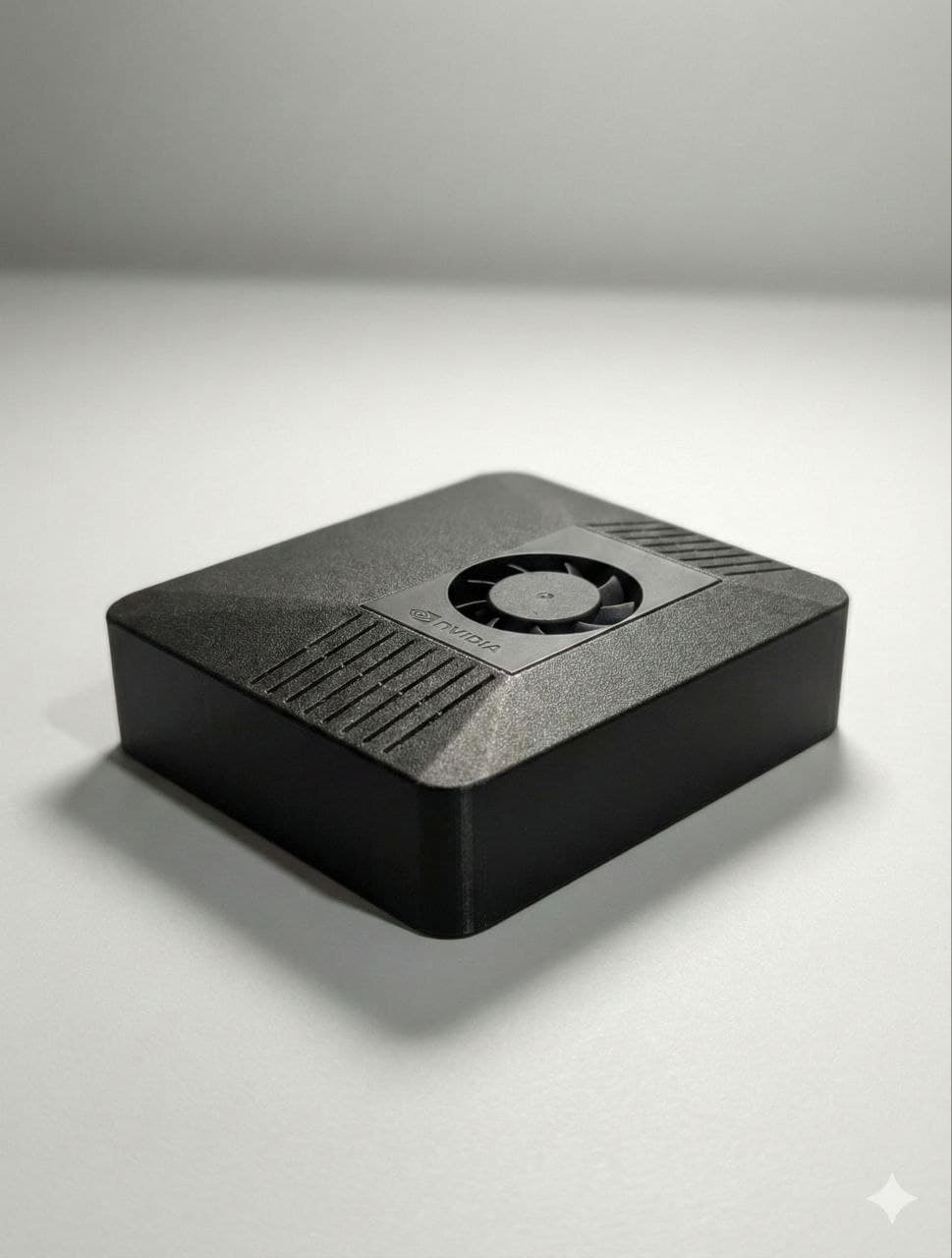
ClawBox is the preferred OpenClaw hardware — an AI assistant that automates email, browsing, reminders, coding, and marketing while you sleep, on a box you own. €549 one-time.
For makers, small teams, companies, and privacy-first operators.
ClawBox is the preferred OpenClaw hardware — an AI assistant that automates email, browsing, reminders, coding, and marketing while you sleep, on a box you own. €549 one-time.
For makers, small teams, companies, and privacy-first operators.
Useful AI shouldn't be this hard.
Your to-do list grows
You don't know where to start
Your AI can vanish overnight
Plug it in. Choose your AI. Start delegating.
Plug in
Power and network, then a 5-minute wizard does the rest. You're online before your coffee is ready.
Choose AI
Local AI on the box, or plug in Clawbox AI, GPT, or Gemini. Switch in one click — you stay in control.
Send task
Send a task from Telegram, voice, or the web. Your AI does the work while you sleep. No code.
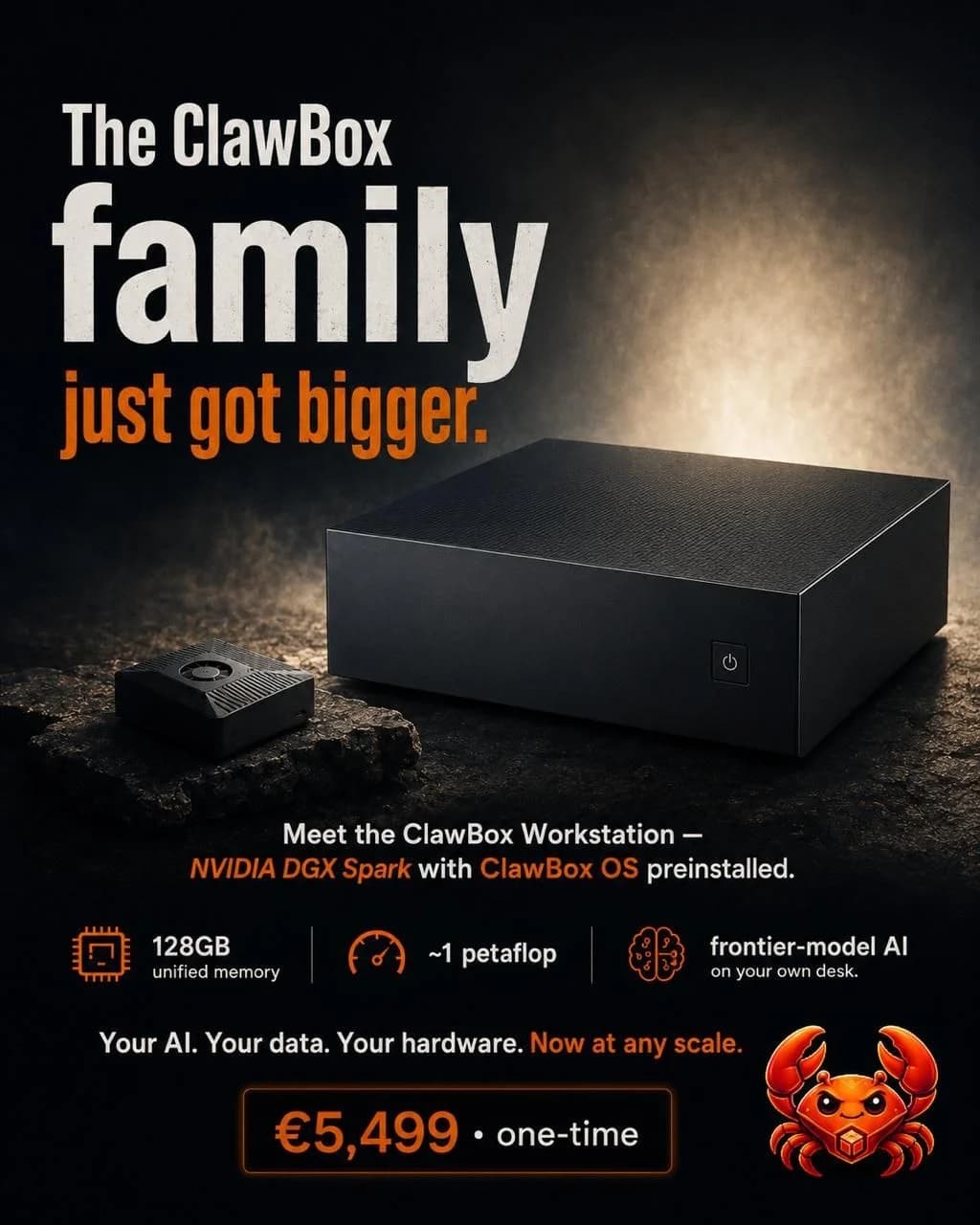
The family just got bigger
Meet the ClawBox Workstation
Frontier-model AI on your own desk — an NVIDIA DGX Spark with ClawBox OS preinstalled. Your AI, your data, your hardware, now at any scale.
Explore the WorkstationHardware Specifications
Powered by NVIDIA
- 512GB SSD
- 67 TOPS
- 6-core Cortex ARM
ClawBox OS
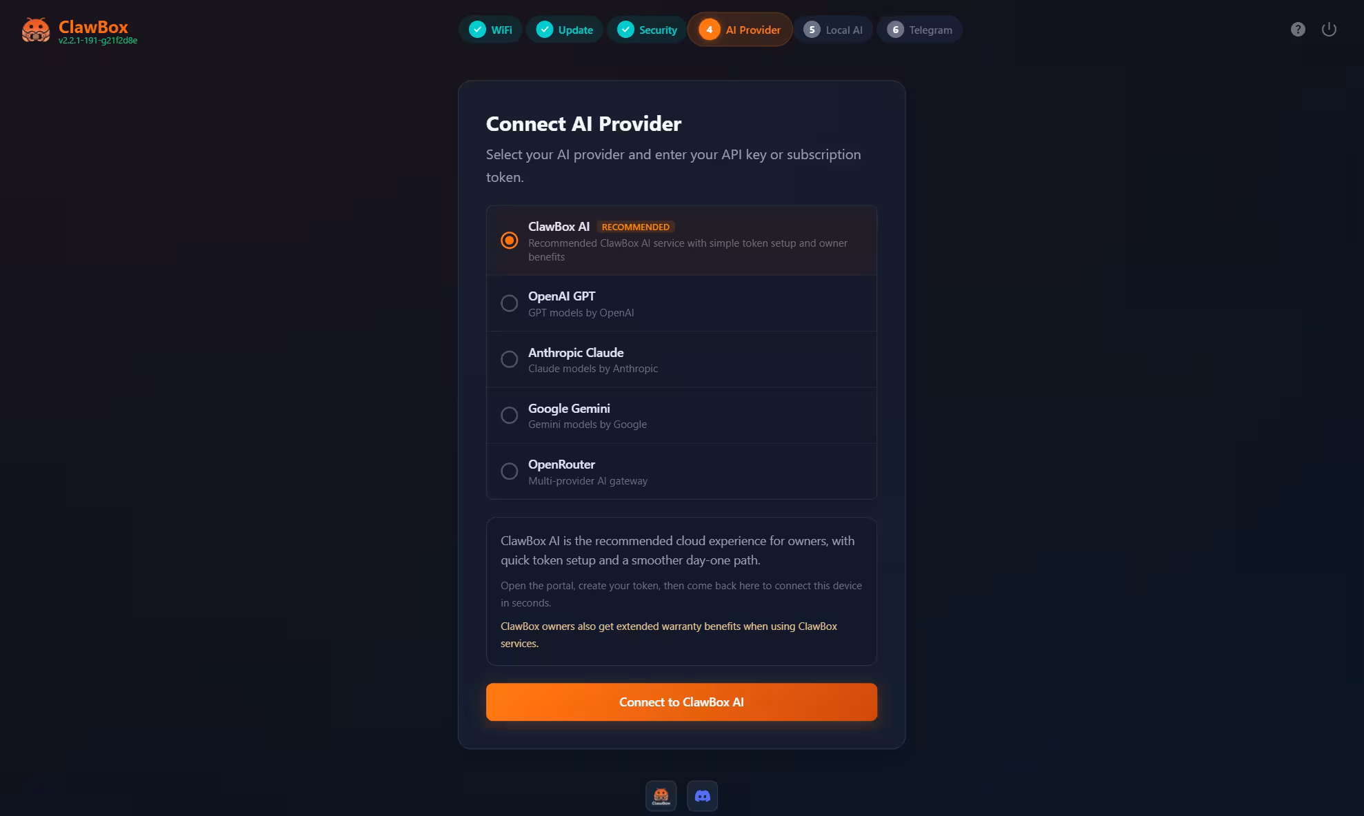
Your favorite AI, live in one click.
Plug in Claude, GPT, Gemini, or ClawBox AI — start on the free tier, upgrade to Max only when you need more. No config files, no terminals. One click and you're ready to delegate.
Automate your week.Get your evenings back.
One device. One-time hardware purchase. No mandatory subscription.
ClawBox
Your always-on AI assistant, on hardware you own. Order today — ready in minutes.